01 Sep Color Crush: Muted Hues
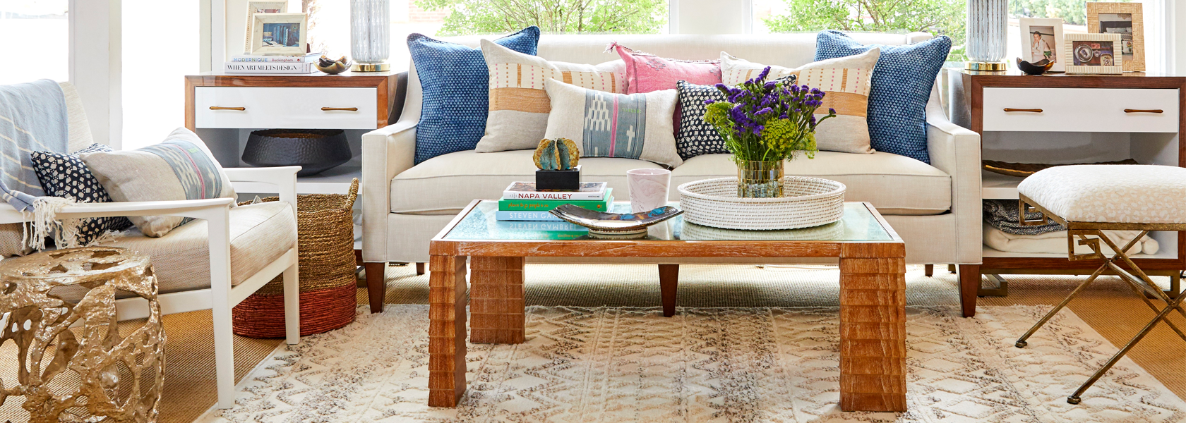
We’ve been using a lot of neutrals and muted hues recently in the shop and in a few projects, and we can’t seem to get enough! The use of this combination of hues creates a soothing aesthetic for any space. We were really drawn to this one setup in the shop and it inspired us to pull some muted color inspiration, both in individual products and in complete spaces.
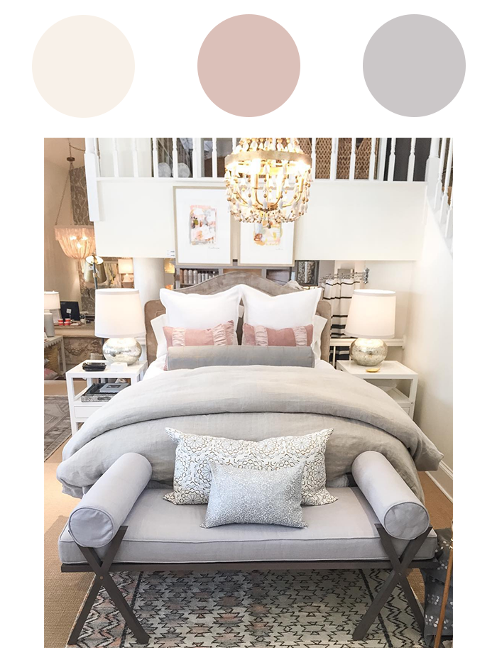
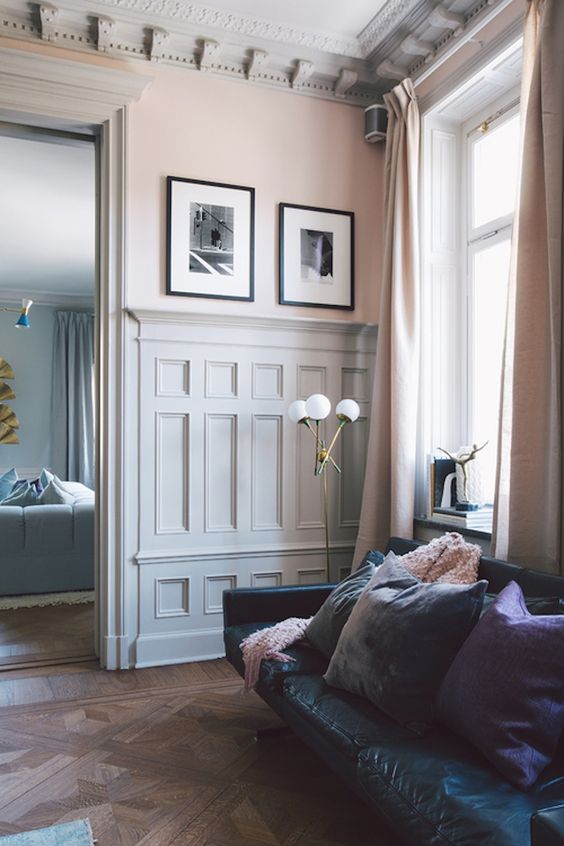
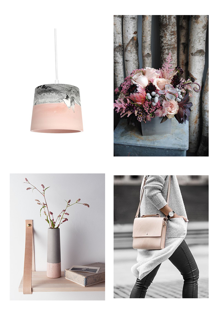
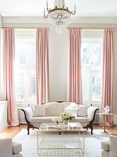
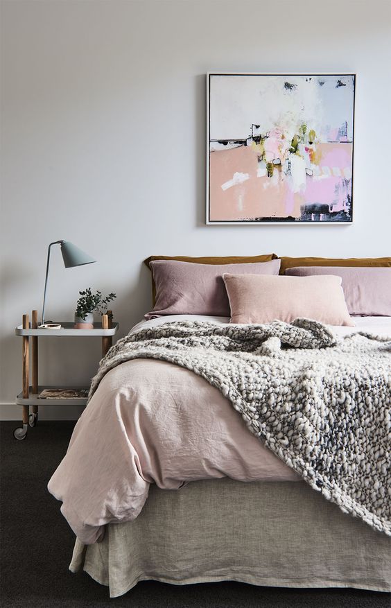
Incorporating accents of blush, soft grays, creams and whites to your palette can give a room a calming vibe, making this a great scheme for bedrooms in particular. Whether in fashion, home decor, or floral design, these muted hues always work well together.
We’re seriously crushing on all of the rooms below. The balance of colors used in these spaces were executed perfectly! We especially love incorporating a harsh contrast with this scheme- since everything is so muted, adding pops of an extreme color, such as these black frames with white mat, really makes a visual impact.
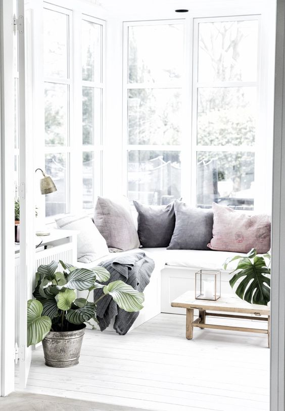
A muted scheme also allows for your plants to really pop, as you can see below!


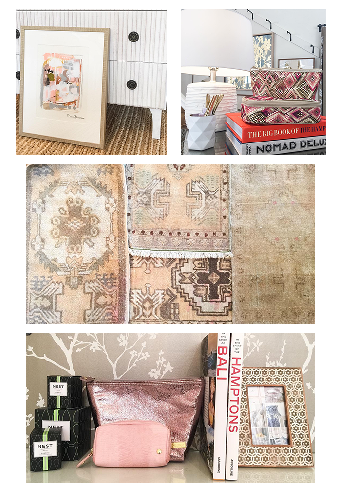
Whether you’re accessorizing a room or your wardrobe, these pieces from the shop would fit perfectly with this muted scheme!
What colors have you been crushing on lately? We’d love to know!