09 Dec Pantone Color of the Year
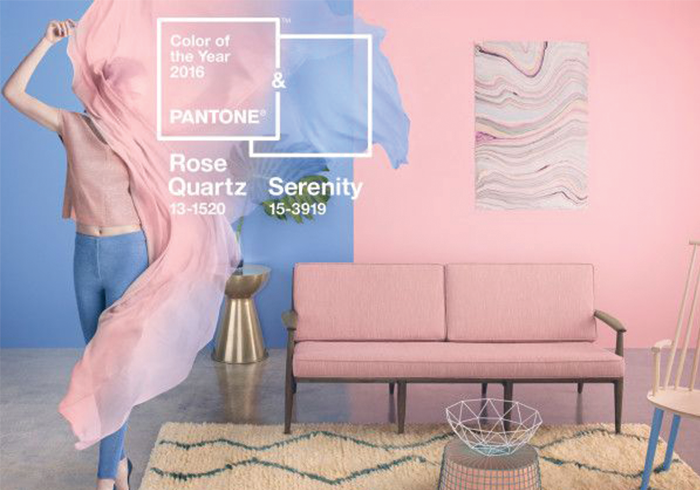
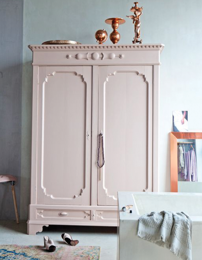
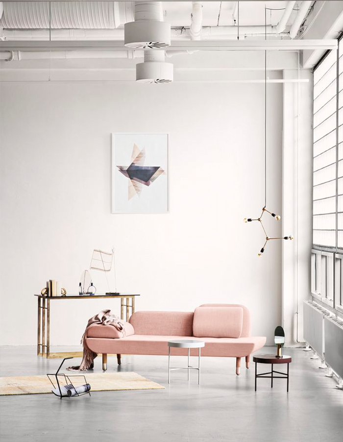
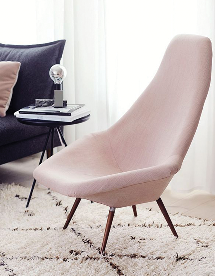
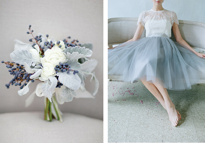
The 2016 Pantone color of the year was recently announced with a bit of a twist. Instead of having just one COTY, Pantone decided to mix it up and forecast the blending of two shades: Rose Quartz and Serenity.

Here’s Pantone’s explanation the two shades:
“Rose Quartz is a persuasive yet gentle tone that conveys compassion and a sense of composure. Serenity is weightless and airy, like the expanse of the blue sky above us, bringing feelings of respite and relaxation even in turbulent times.”
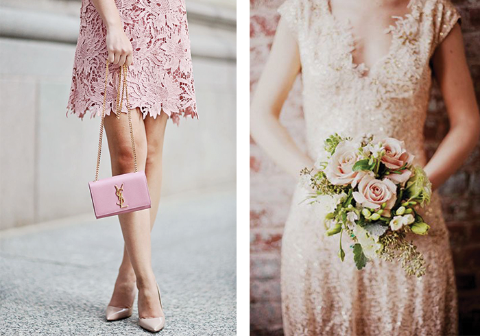
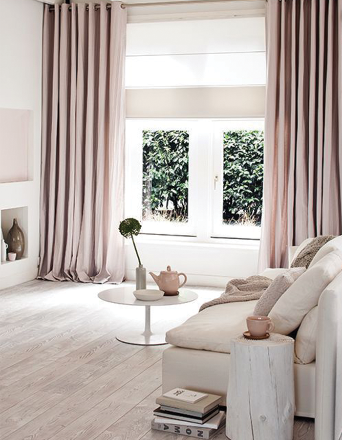
Take a look at a few of our favorite inspiration photos of these two beautiful shades:
Rose Quartz
Serenity
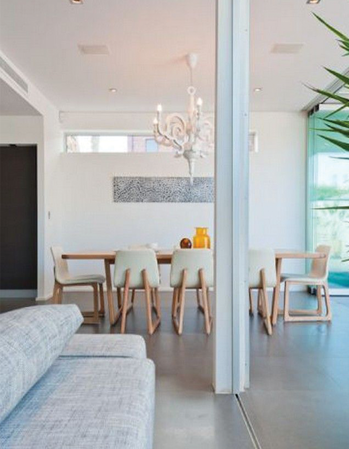
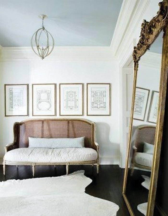
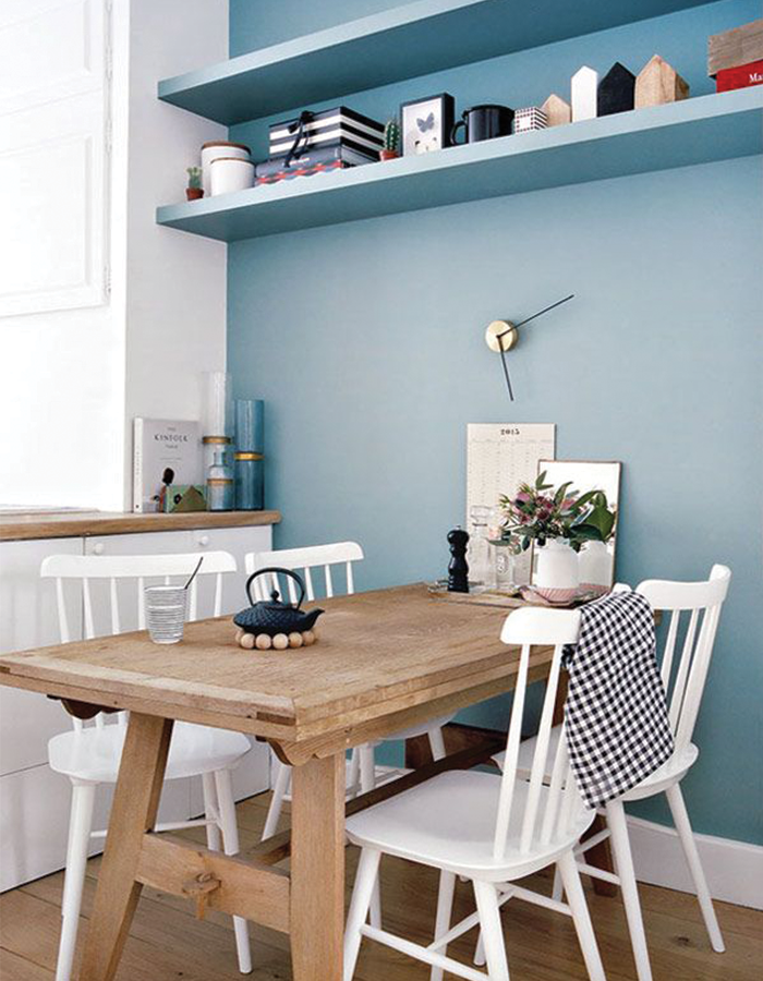
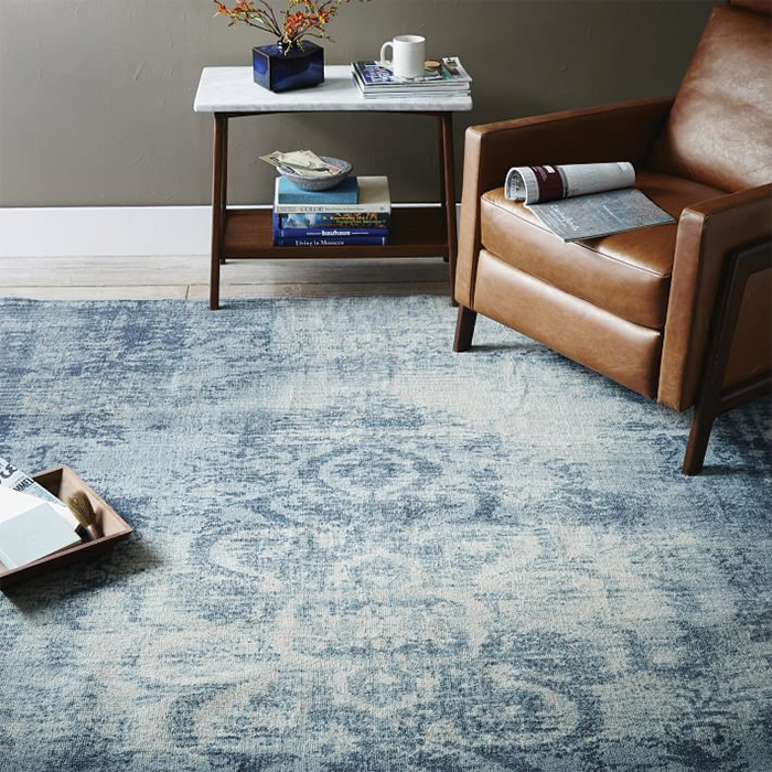
We’re really feeling the calm tones in this year’s COTY choice. What do you think about Pantone’s decision? Let us know in the comments!
Comments
