17 Aug Opposites Attract! Tips for mixing elements for eye-catching interiors
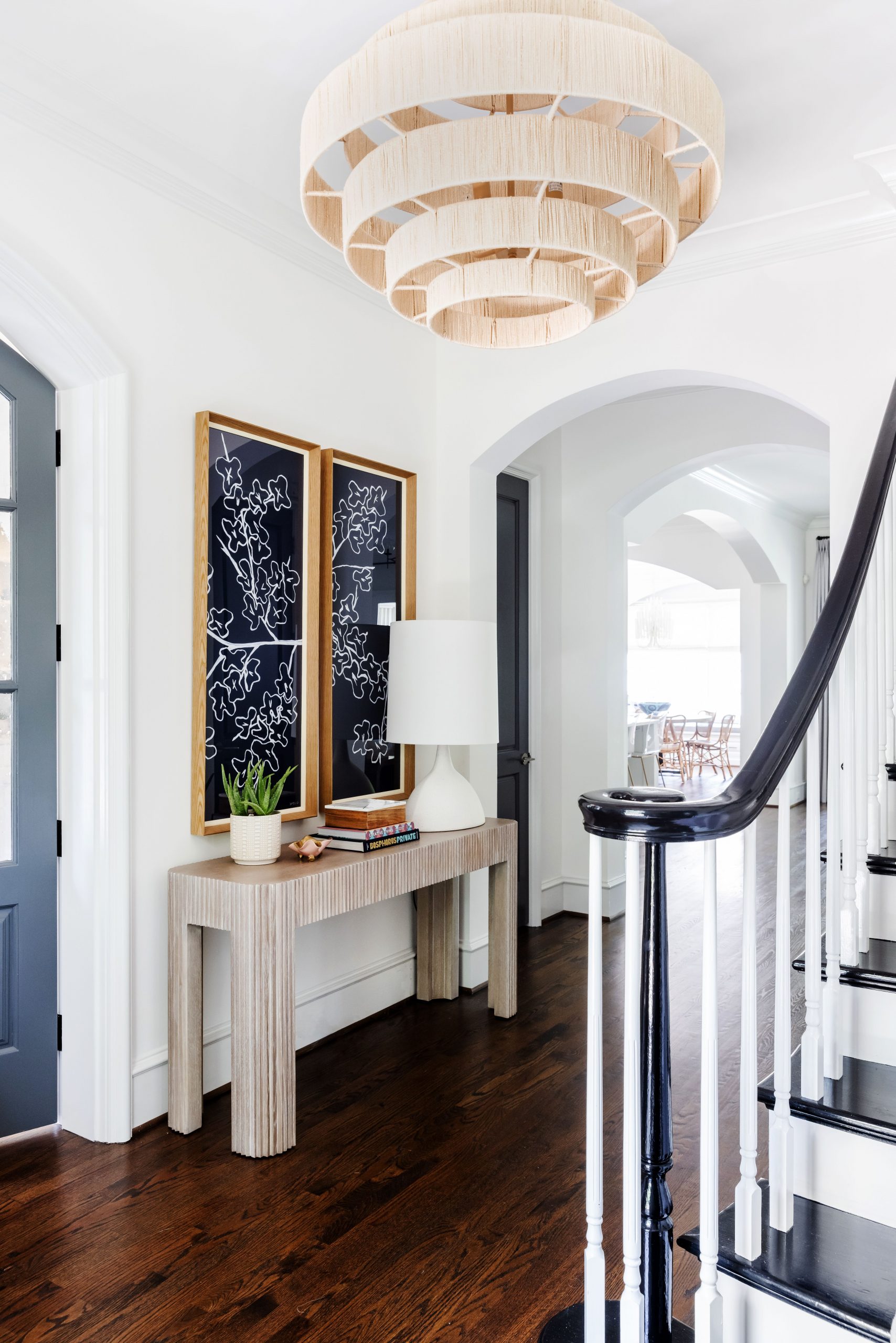
We love how a juxtaposition captures attention in an interior. Those opposites-attract mixes are magnetic, are they not? Like this foyer with a fun mix of opposite elements, starting with bright light walls and rich dark floors. A white lamp pops against striking deep indigo art. Even the painted dark railing and doors complement the fresh, crisp details of the space.
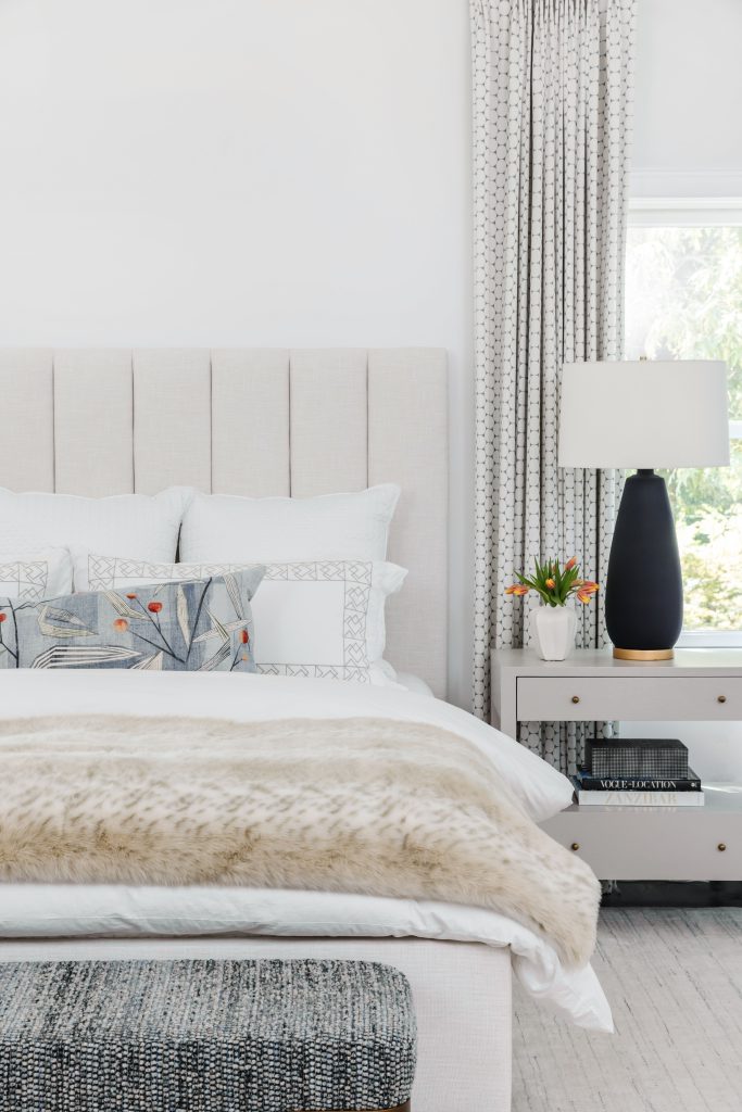
Another classic case of contrasts, Black + White is always a winning mix. Sometimes it’s as simple as adding an element with significant depth of color to an otherwise neutral palette to add interest, like this lamp silhouette in matte black finish, the perfect punch within the soft hues of this bedroom layered with crisp white linens and plush throw.
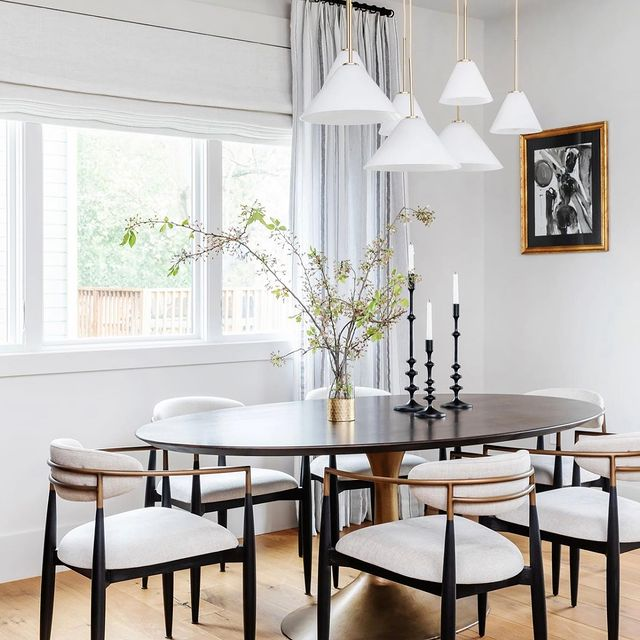
Two local designers we know and love often use black + white in beautiful harmony. This one from Jess at Four Story Interiors incorporates original art framed in a gilded finish, a classic tulip table, black candlesticks, and striking white-on-white chandelier.
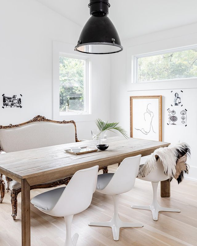
Another design by Hillary of Millicent Design Studio is such a great example of opposites working together for a total ooh-aah factor. High Gloss White + Rustic Wood; Victorian Settee + Mid-Century Mod; Cool Industrial Lighting + Warm, Cozy Textures; and of course Black + White Simplicity.
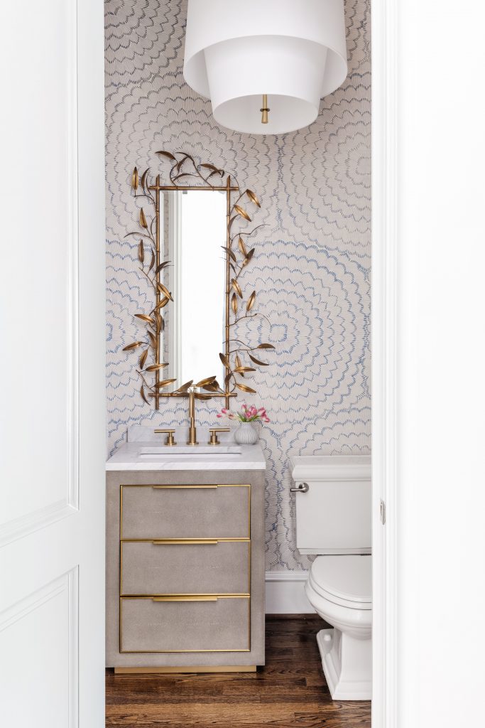
Playing with opposites work in any room of the home, like this sweet powder bath we recently completed. We love the contrasts of Modern + Vintage and Large + Small represented in this bath design, including the current large print wallpaper + vintage-vibe petite mirror.
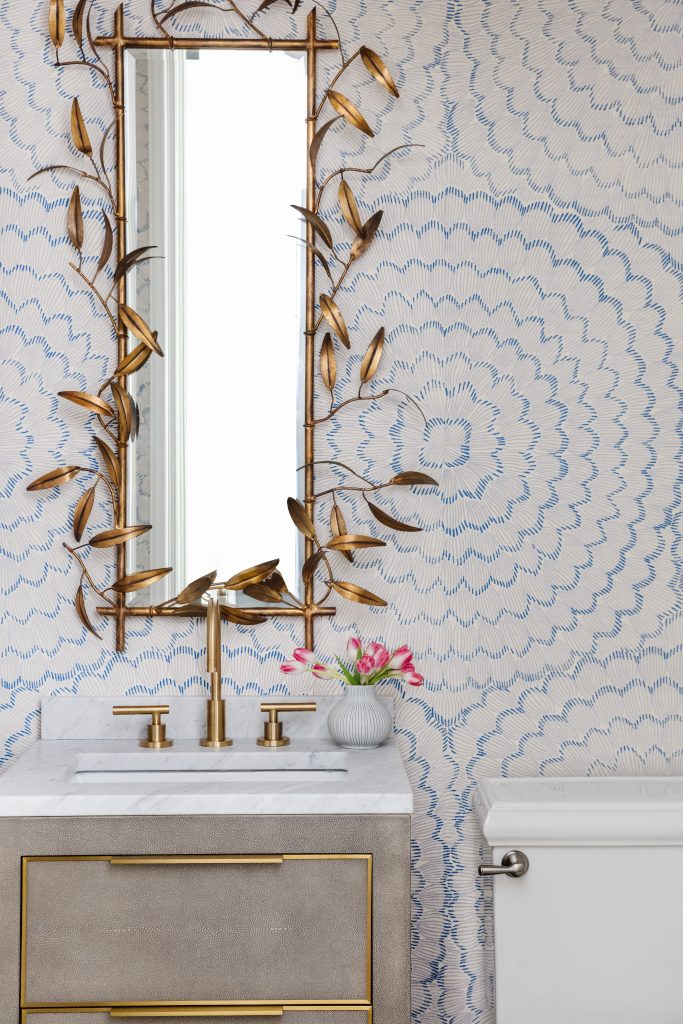
Plus this big-scale pendant light mixed with the narrow, smaller scale mirror. The mix makes the magic. The scale matters in this scenario. The oversized light fixture makes a statement and draws your attention to all the pretty details of the brass mirror’s leaf-shaped edges. We love the layers of opposites happening in this design situation, Modern mixed with Vintage; Large Scale + Small Scale. The sleek lines and style of the the light shade work in synergy with the modern graphic wallpaper, especially in combination with the fluid forms, organic shape and antique finish of the mirror.
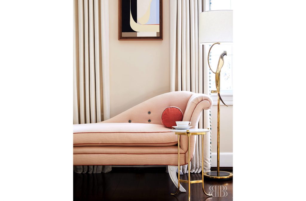
Then there’s the attention-getting opposing lines of Straight + Curves. A totally sexy duo. We love the way Barrie Benson blended the two in this vignette. The curvaceous goodness of a swanky day bed and round accent table countered with a modern linear abstract.
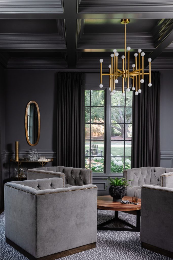
Last but not least, we’re always obsessed with the mix of Cool Grays + Warm Brass. We especially love it in this moody, ultra uptown bourbon room in one of our favorite client’s homes. The textures are a mix too. Soft velvet tufted chairs are a traditional upholstery go-to, but we did it in a modern shape. Don’t you just want a cocktail in this chi-chi space? We definitely do!
Follow along with us on our Instagram stories for even more visual inspiration + see how opposites attract in oh-so-many ways!!!
The ladies of ISABELLA
*All ISABELLA images photographed by Laura Sumrak